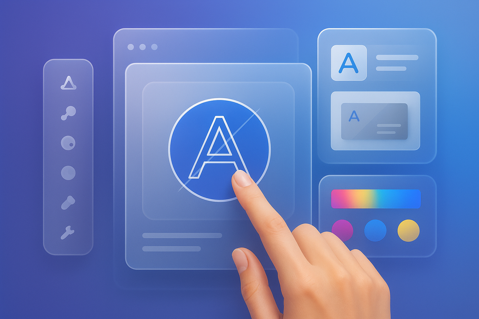
Your logo is often the first thing people notice about your business. And when it comes to building a brand identity that feels both personal and professional, combining text and icon thoughtfully can make all the difference.

Let’s dive into how you can strike the right balance between these two elements—no design degree needed.
Why Balance Matters in Visual Branding
Small businesses and startups often wear many hats—especially when launching a brand. You want a logo that tells your story, sticks in people’s minds, and works across everything from packaging to Instagram.
But here’s the challenge: text-only logos might be too plain, and icon-only designs may confuse people. The magic happens when you blend the two in just the right way.
Balancing text and icon helps:
- Make your name more memorable
- Add meaning through imagery
- Scale better across digital and physical platforms
This isn’t about making things look fancy. It’s about creating a visual identity that feels cohesive, clear, and aligned with your mission.
Understanding the Role of Each Element
Before you try combining anything, it’s helpful to understand what each part brings to the table.
Text is straightforward. It spells out your name, tells people what to call you, and adds structure to your logo. The choice of font, size, and layout helps reinforce your brand’s voice—whether that’s casual, modern, or classic.
Icons, on the other hand, carry emotion and symbolism. A leaf can signal sustainability, a spark might mean innovation, and a heart suggests care or community. Icons make your brand instantly recognizable, even when text isn’t visible.
Used together, these elements can tell a fuller story. The goal is not to let one overpower the other—but to make them feel like they belong to the same brand family.
Choosing the Right Type of Icon

You don’t need an elaborate symbol to stand out. In fact, simple, meaningful icons are often the most effective. But how do you choose the right one?
Start by asking yourself:
- What does your business stand for?
- Are there objects or shapes that represent what you do?
- Do you want something abstract or literal?
For example:
- A freelance photographer might use a clean camera outline next to their name.
- A children’s bookstore could pair playful fonts with a stylized book or star.
- A tech startup might choose a minimalist symbol like a pixel grid or geometric shape.
Keep in mind that your icon doesn’t need to tell your whole story—just support it.
Many tools, including an AI logo generator, can suggest icons based on your industry, values, or keywords, helping you visualize different options quickly.
How to Match Font and Icon Styles
If your icon says one thing and your font says another, your logo might end up feeling disjointed. That’s why style pairing is a crucial part of the design process.
Here’s what to look out for:
- Consistency in tone – A techy icon pairs well with clean, modern fonts; a cozy icon might need a softer, rounded typeface.
- Weight and balance – If your icon is bold and heavy, don’t use a super-thin font next to it.
- Shape harmony – Curvy icons tend to pair better with fonts that have some roundness; sharp icons like triangles or arrows work best with angular type.
It’s like dressing for an event—everything doesn’t have to match exactly, but the whole outfit should feel intentional.
Tools like Turbologo allow you to preview these combinations in real time, making it easier to experiment without getting stuck.
Best Practices for Combining Text and Icon
Let’s break down a few practical rules to guide your logo layout:
• Place with intention
Whether the icon sits on top, beside, or is integrated into the text, spacing is key. Too close and things look crowded. Too far and they feel disconnected.
• Keep it simple
Complex icons may look beautiful when large, but they often lose detail at smaller sizes. Prioritize clarity.
• Limit your colors
Using too many colors can cause chaos. Stick to one or two that reflect your brand.
• Use scalable formats
Make sure your logo works in black-and-white, small sizes, and across different backgrounds.
• Make variations
Design horizontal, vertical, and icon-only versions of your logo so it fits wherever you need it.
• Think long term
Trendy designs fade fast. Choose elements that support your brand’s long-term vision.
• Test your design
Show your logo to others. If they “get it” instantly and remember it, you’re on the right track.
These steps don’t require advanced tools or knowledge—they just need a clear eye and a little patience. Don’t be afraid to revise your layout until everything feels right.
Key Mistakes to Avoid
Even strong ideas can fall flat if the execution isn’t thoughtful. Here are common mistakes to watch out for:
• Icon feels random
If the symbol doesn’t relate to your business or brand story, it creates confusion.
• Font is hard to read
No matter how stylish a font is, if people can’t read your name, it’s not doing its job.
• Spacing is awkward
Don’t cram your text and icon together. Give them room to breathe.
• Relying only on trends
Trendy fonts or symbols can date your logo quickly. Stick with elements that make sense for your brand.
• Ignoring flexibility
Your logo should work in color and grayscale, and be clear even at the size of a mobile app icon.
• Skipping testing
If you don’t see how your logo looks on different backgrounds and formats, you might run into trouble down the line.
Avoiding these pitfalls helps ensure your logo remains timeless, recognizable, and effective in all contexts.
Quick Design Checklist for a Balanced Logo
Use this list as a final gut check before finalizing your brand logo:
• Does the icon support my brand story?
• Is the font style appropriate and readable?
• Do the icon and text feel visually balanced?
• Does the logo scale down clearly?
• Is there enough spacing between elements?
• Does it look good in one color?
• Do I have horizontal and vertical versions?
• Have I tested it on different devices and screens?
Once you’ve walked through this checklist, you’ll have a much clearer sense of whether your design is ready—or still needs tweaking.
Many new business owners say this is the step that gives them confidence moving forward with branding.
Conclusion: Create a Logo That Works Hard and Feels Right
Finding the balance between text and icon isn’t about rules—it’s about clarity, connection, and consistency. When you align these two elements with your brand’s story and tone, your logo becomes more than decoration. It becomes a signature.
Trust your instinct, keep things simple, and give yourself space to explore. And if you’re looking for guidance or ideas to get started, tools like Turbologo can help visualize how your brand identity might take shape.
With the right balance, your logo won’t just look polished—it’ll feel like it truly belongs to your business.




Leave a Reply