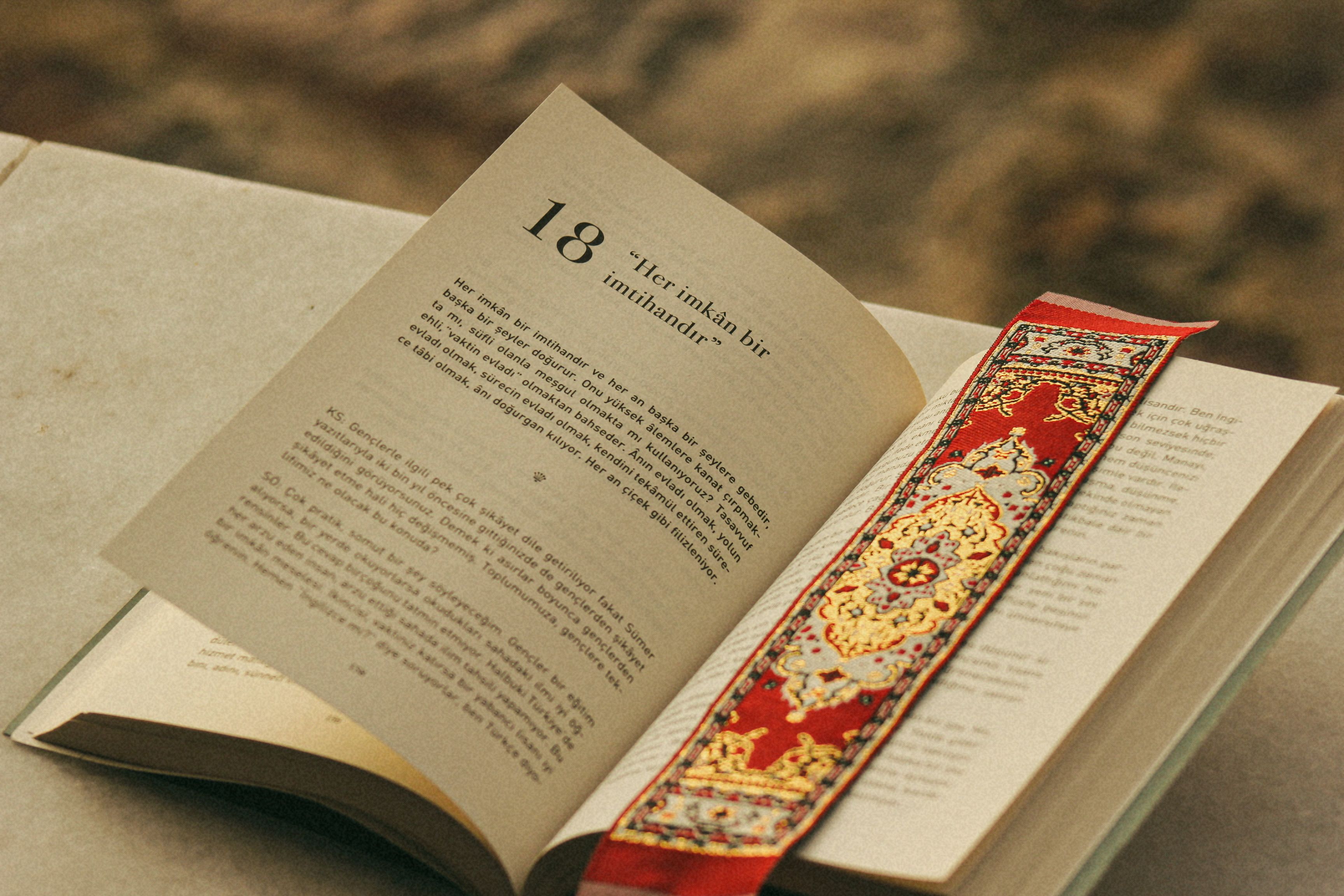
A stack of three books with a bright bookmark can say more about a community book swap than a complicated illustration of a crowd. For a proposed neighbourhood event poster, I would begin with that small arrangement. The event is hypothetical, so the design exercise would contain no invented venue, date or claim that a local organisation has already agreed to take part.
The poster’s first job is to explain the idea. People should recognise books, notice the invitation and find the practical details quickly. I would reserve the upper half for a clear heading and place the illustration below it. A cheerful palette could make the design welcoming, but the picture should not become so elaborate that the event information feels like an afterthought.
A first image study in nano banana 3 would use plain book covers with no readable titles. This avoids suggesting that particular authors or publishers endorse the event. I would choose three different cover colours and one orange bookmark, keeping the shapes familiar. The illustration could suggest variety without trying to represent every kind of book that a future participant might bring.
The stack provides a focused subject for nano banana 3, which can generate and edit the still artwork while the organiser develops the actual event details separately. I would describe slightly uneven book positions, soft shadows and a clean background. The aim is an original poster illustration, not a photograph presented as evidence of an event that has already happened.
Make the books feel inviting rather than precious
I would avoid a polished display of identical hardbacks. A community swap suggests books that have been read and are ready for another reader. A gently curved cover or a slightly softened corner can communicate that idea without making the books look damaged. The visual tone should be friendly and ordinary, closer to a shelf at home than a luxury collector’s display.
My initial nano banana 3 brief would specify a blue book at the bottom, a cream one in the middle and a muted red one on top. The orange bookmark could emerge from the cream volume. I would keep the stack low and stable, leaving enough space around it for the poster’s text. Tall, precarious piles might look playful but could distract from the invitation.
After generation, I would check the page edges and covers. A book with two spines or pages that run through another volume needs correction. Simplifying the arrangement may help more than requesting greater detail. The illustration should remain recognisable at a glance, and a small number of well-defined objects is usually sufficient for that purpose.
Give the bookmark a useful role
The bookmark is the smallest element, but it can guide the eye. I would let it point gently toward the event details without turning it into an arrow. Its orange colour could also become a small accent in the heading or divider line. Repeating one colour sparingly helps the poster feel connected without surrounding the books with extra decorative shapes.
If the bookmark disappears behind the stack, I would adjust it in nano banana 3 while preserving the books’ positions. The revision should keep the strip clearly attached to one volume. A floating ribbon would be confusing, while an oversized one could dominate the image. I would judge the result at the poster’s intended size rather than only in a large preview.
The background would remain pale and relatively flat. A detailed library interior might establish a setting, but it could also imply a venue that has not been selected. A simple background avoids that problem and makes the illustration easier to reuse across formats. It also gives practical text a calmer surface and keeps printing requirements relatively straightforward.
Put verified event information in the layout
For a real poster, the organiser would need to confirm the location, time, participation rules and contact details before publication. I would add those words in a separate design application. The generated image should not contain a fake address or a date that later gets overlooked. Keeping artwork and factual copy separate makes updates easier and reduces avoidable confusion.
A short heading such as Bring a Book, Find a Story could introduce the concept, followed by the confirmed practical information. I would check that the wording accurately describes how the event works. If there are restrictions on donations or exchanges, they should be stated clearly. The illustration cannot communicate those rules by itself, however welcoming it looks.
A further nano banana 3 edit might create more empty space beside the stack if the layout needs it. I would review the entire image after the change, checking that no extra books or unintended lettering appear. More background is useful only if the main illustration still feels balanced. The image should serve the information rather than force the information into an awkward position.
Prepare a version for the noticeboard and the phone
A printed noticeboard poster and a social post have different viewing conditions. I would keep the same books and colours but adapt the text layout for each. The phone version may need fewer words on the image, with additional details in accompanying copy. The printed version should make essential information readable from a reasonable distance.
Before finalising the nano banana 3 artwork, I would preview a square crop and a taller poster crop. Both should retain the bookmark and enough of each cover to show a stack rather than an ambiguous block. If a crop loses the idea, I would change the composition instead of stretching the image or shrinking the text until it becomes difficult to read.
I would also prepare a concise description of the illustration for accessibility and review the contrast of the final typography. These are practical publishing decisions, separate from creating the image. A welcoming community poster should be easy to understand in the places where people actually encounter it, whether that is a shared noticeboard or a small screen.
Keep the invitation grounded
The final design would show three plain books, a bright bookmark and a clear invitation. It would not feature invented participants, fabricated endorsements or photographs of a crowd that never attended. If the event later takes place, genuine reporting and authorised photographs can tell that story. The proposed poster simply helps explain an idea before it happens.
That modest role is enough. A useful illustration can give a community message warmth while leaving the real details visible and accurate. I would call the design finished when the books are recognisable, the text is readable and the poster makes the next step clear. The strongest image is the one that helps people understand the invitation, not the one with the most decoration.
Leave a Reply